
In the early days of craft beer, bottles and cans seemed to all be saying, or maybe screaming, the same thing: Drink me if you dare. Breweries relied on intense imagery to telegraph an air of exclusivity. Consider Stone Brewing, formed in California in 1996, whose labels center gargoyles in a variety of aggressive poses, and whose offerings include Stone IPA, an influential beer of the style. Or, see Indiana’s 3 Floyds Brewing, founded the same year, which took a less medieval, more metal approach to its visual identity. The bottle of its cult classic Zombie Dust, an American pale ale first released in 2010, features artwork of the undead by comic book artist Tim Seeley, who often dabbles in horror.
Heady Topper, first canned in 2011 by The Alchemist brewery in Vermont, represented the start of a shift. Designed by Dan Blakeslee, an artist and musician who came to beer labels by way of concert posters, the now-iconic can features a bearded, bow-tied man sipping a glass of beer—breaking the brewery’s cardinal rule to drink from the can—as a cloud of hops explodes out of the top of his head. It’s monochromatic. It’s confident. It seems more interested in evoking its own world than in referencing tropes from another. With its shaded lines and heavy serif lettering, it more closely resembles an Art Nouveau etching than an Iron Maiden album cover from the 1990s, but it continued the tradition of florid, illustrative labels.
If the rise of craft beer came from a craving for more depth of flavor, then the marketing of these beverages needed to be more visually rich than that of their corporate competitors. There was a need to distinguish craft beer from, you know, regular beer. For this reason, IPA labels tend to read as a provocation: Can you handle this much hoppiness? And, for a long time, most IPAs in the United States were homebrewed, poured directly from growler or tap to glass, so packaging design simply didn’t exist, or was not intended for wide distribution. Once bona fide IPA brands started to emerge in the ’90s, their visual identity was shaped not by a long tradition, but by a very particular strain of masculinity and one-upmanship that was characteristic of the beer culture at the time.
As American craft beers have expanded beyond the IPAs of the ’90s and early 2000s, the look of the industry as a whole has generally become less over-the-top. On today’s craft beer shelves, there are fewer representational motifs, and more modern, modular graphics. Increasingly popular craft pilsners, with their lighter, clearer flavor and comparatively minimal branding, are a particularly good example of the shift to market craft beer to a wider audience, and they’ve become the defining style of the aesthetic. “There’s no explosions or dinosaurs on the outside of pilsner cans,” says Cory Muscato, co-owner of The Beer Keep, a craft beer bar and shop in Buffalo, New York, which stocks some 250 SKUs. “I would describe the labels for IPAs as like a Michael Bay movie,” he says. “Pilsners are a little bit more classical.”
Here are five pilsner cans that offer a look at the new face of craft beer.
Designers Max Kaplun and Audrey Robinson have been friends with Dan Suarez and Taylor Cocalis since their days in Brooklyn, when they’d hang out at Beer Table in South Slope. Today, Kaplun and Robinson are based in Montreal, and Suarez and Cocalis are in New York’s Hudson Valley, where they run their eponymous brewery. “We always love working with Max and Audrey expressly because there is such a human element—much like with the beer,” says Cocalis. For the Palatine Pils, one of the first label projects the pair worked on, that human element came from analog inspiration. “We arrived at the look for these particular labels by digging up some vintage French type specimen books that really had this funky look you just couldn’t achieve with a digital font,” says Kaplun. (Type specimen books are exactly what they sound like, essentially field guides for fonts.) Reference in hand, the designers took to the screen to create the Palatine Pils label from scratch, which, with its ribbony lettering and oversized dots over the i’s, looks like it could be the sign for a very sophisticated 1950s bowling alley. It’s at once textured and refined, or, to put it in Cocalis’ words, “classic, yet fresh.”
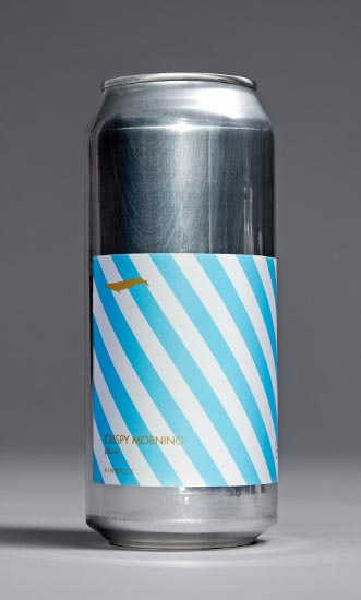 “Our general approach is to create designs that are simple and graphic,” says Basil Lee, co-owner of Finback Brewery in Queens. Finback’s label design has always been done in-house, and these days, Lee’s partner Kevin Stafford handles that side of the business. For Crispy Morning, the brand’s core pilsner, the goal was to create something iconic and versatile. (The brand has also brewed some variants, like Crispy Town, and changed the color of the lines.) Crispy Morning’s sky-blue diagonal stripes recall paper straws from the Eisenhower era, hinting at the imminent refreshment that lies inside the can. They’re also a departure from the brand’s typically more dreamy, weird designs. Though the expressions are varied, Finback’s 16-ounce cans are recognizable on a shelf because the labels—each of which contains a fin-shaped mark on the upper-left corner—cover only two-thirds of the surface, exposing much of the shiny metal. That consistent, shrunken sizing allows for lots of variety across labels, while still appearing unified.
 “I kind of liked playing on the idea of not being blind drunk,” says John Gilsenan of London-based branding agency IWANT, who based the Talea design around the shapes found in his collection of vintage optometrist lightboxes, the kind used for eye exams. When Gilsenan was working on the can for Al Dente, the company’s Italian-style pilsner, he knew that he needed to “strip the design back a little,” more than he would for a seasonal, small-batch offering, because it needed to be able to grow with the brand. The result is spare but striking: two stacked dots, one a muted San Marzano red, the other a Mediterranean blue or sage green, depending on the can. Talea’s elemental approach to packaging design reflects the business model of modern craft breweries, many of which produce a number of beers per year. Though Talea’s visual language continues to evolve with its expanded offerings, those original optical-inspired elements still inform the overall identity.
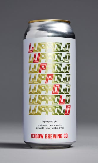 For Will Sears, the art director at Portland, Maine’s Oxbow, the goal with the packaging design for Luppolo was to celebrate the culture it came from. The brew type, a dry-hopped Italian-style pilsner, directed Sears to midcentury European graphics and ultimately led to “old Italian bicycle stuff,” which shows up in the horizontal repetition of a sporty but artful squared-off type, including a diagonal of the beer’s name in red. The design has a quick, quiet sense of motion. Sears sketches in notebooks “constantly,” and every Oxbow design starts as a hand drawing that then gets scanned in and vectorized. He likes the “freedom through restriction” that comes from the brand’s tight design system, which includes a color palette consisting of just three colors: light blue, red and black (plus gold, but only for lagers). Illustrations are limited and often incorporated into the lettering. But the streamlining of label design isn’t just about aesthetics—it’s good business, too, as a limited graphic system is easier to scale than a single illustration style.
 “Bellweiser was inspired by the classic Canadian stubby bottles our parents and grandparents drank when we were growing up,” says Ross Proulx, of Toronto-based design and illustration studio Doublenaut, who cites Labatt, Old Vienna and Red Cap’s “strong use of typography and bold supporting graphics” as influences. Before Bellweiser’s launch, Bellwoods Brewery (also in Toronto) was known for its IPAs and sour beers, which were marked by a largely illustrative packaging design style. In an effort to distinguish Bellwoods’ first pilsner and the line that would follow, Doublenaut shifted to using type as the primary element of the design, contrasting with simple shapes. But the design keeps things interesting by juxtaposing a variety of types, stacked right on top of one another. To achieve at-a-glance legibility without having to make the type smaller, the name is split, and the fonts differentiated—“Bell” in a robust cursive, and “Weiser” in a chunky, approachable sans serif. In a way, Bellwoods’ and Doublenaut’s foray from IPAs into pilsners matches the arc of the face of the industry overall—from dank, doodly and doing-the-most to crisp, clean and contained.