Lyle’s Golden Syrup is undergoing a redesign. The British baking staple, now owned by Tate & Lyle Sugars, is highly recognisable because the logo has been unchanged for 140 years. The product is even the Guinness World Records holder for the world’s oldest logo.
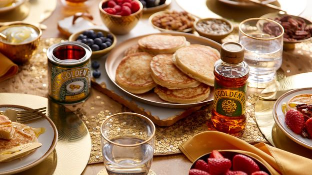
Now, the company has redesigned the label on some of its products. The syrup that comes in a tin will retain the old label (the brand put out a social media post assuring dedicated consumers it wouldn’t be changing), while a new design has been released for other products, as well as the Lyle’s Golden Syrup that is sold in plastic bottles.
James Whiteley, brand director for Lyle’s Golden Syrup, told BBC News, “Our fresh, contemporary design brings Lyle’s into the modern day, appealing to the everyday British household while still feeling nostalgic and authentically Lyle’s.”
The old logo features a lion carcass surrounded by bees. According to the brand’s website, the company’s founder, the Scottish businessman Abram Lyle, wanted a logo that was inspired by a story in the Old Testament. It’s a nod to Samson, who kills a lion with his bare hands, but then discovers the bees have swarmed the dead lion. “Lyle had strong religious beliefs, which is why the tin’s famous logo depicts strongman Samson’s ‘lions and bees’ from the Bible’s Old Testament,” the brand explains on its website. “Out of the strong came forth sweetness,” the label reads.
The update won’t lose its central feature – the lion – though only its face appears, and instead of being surrounded by bees there is only one bee hovering over the lion’s head. It also retains its key colours, green and gold. Amrit Vin, a graphic designer and the editor of Brand New, a site dedicated to new and redesigned logos, says that important redesign considerations are solving issues with the old logo, and being “conceptually meaningful”. He feels the company managed to strike a balance between holding onto a “connection to the lion” while making it more “easily discernible”. He also says the new logo is easier to apply across all products.
While the change may seem overdue to some, altering the lion has caused an uproar online. Social media users, as well as news articles have critiqued the changes. “Why bother changing the squeezy bottle to blend in with the other homogeneous brands?” one Instagram user asked on the company’s page. “This feels like a waste of time and money.”
One X (formerly Twitter) user who said he was a descendent of Abram Lyle, explained the history of the logo in a post, and said he personally felt “the loss of Abram’s tin”. He told the Telegraph that the brand is “changing something that is both very distinctive and familiar to something generic and woolly”. The company also faced criticism from Church of England members who claimed the rebrand “eradicates” their Christian message. Tate & Lyle Sugars apologised for the upset caused and said religion played “no part” in the redesign.